Project Overview
In the rapidly evolving e-commerce landscape, platforms must be both intuitive and engaging to differentiate themselves in the competitive market. Success depends on their ability to adapt and meet users' demands for convenience, efficiency, and innovation. My case study outlines the two-week redesign of the Cheeky Monkey Toys website, focusing on a user-centered design approach to significantly enhance the overall shopping experience.
Cheeky Monkey Toys faced substantial challenges, including complicated navigation, visual clutter, and limited functionality, which negatively impacted user satisfaction and made product discovery difficult. My goal was to address these issues by modernizing the design, streamlining navigation, and overall look of the site. User interviews and personas guided these enhancements, shaping both the content and design elements, including font and color choices.
Identifying The Need for Redesign
Cheeky Monkey Toys is a local, family-owned toy store in downtown Menlo Park since 1999. With a knowledgeable staff always ready to help customers choose age-appropriate gifts and complimentary gift wrapping, they strive to create a joyful shopping experience. They have earned a spot among the top toy shops in the Bay Area.
However, their online store fell short of this experience. It lacked user-friendliness and failed to provide the same level of availability, ease, and support that the physical store offers to the community.
The navigation experience could be significantly improved. The "Shop Online" tab on the homepage directs users to view all categories, which can be overwhelming. Once an age group is selected, if a category is also chosen, the results reset and only the latest filter (the category) is applied. This functionality is available through a secondary button that isn’t very obvious to users. Additionally, the side navigation problem contributes to the confusion, making it difficult for users to easily navigate and refine their selections.
The product page effectively provides detailed descriptions and specifications for each item, but it lacks community reviews, which would enhance the shopping experience. Additionally, it includes some information that would be better suited for the checkout page, such as gift wrapping options and estimated shipping costs.
Research
To gain deep insights into the user experience and identify pain points, I conducted a series of interviews with four participants who regularly shop for toys online. I aimed to uncover the key elements that contribute to an exceptional toy shopping experience, both in-store and online.
I then synthesized my findings into an affinity map, which highlighted key trends and insights:

Users appreciate seeing genuine reviews when shopping for toys, as this helps them make informed decisions.

They enjoy having the option to create a wishlist that allows them to return to items later.

They often prefer to purchase toys that provide educational value, seeking options that not only entertain but also promote learning and skill development for their children.

Users like to shop or filter by age. That is one of most used filters when it comes to searching toys online.

Users place a high importance on the quality and materials of the products they choose.

Users want the product page to be descriptive along with video content to help them decide if this is the right toy to purchase.
Based on these insights, I developed a persona representing our typical user.
Behaviors
Does research before picking out toys.
Prioritizes the quality of the toys.
- Enjoys going to the store with her son so he can interact with the toys, but doesn't always have the time.
Prefers to buy toys that support her son’s development and offer educational value.
Needs
Finding toys that are high quality, educational, and age-appropriate for her child.
Comprehensive reliable information to be accessible online
Assurance that the toy is safe for her child.
Frustrations
Choosing the right toys for other kids.
The product arrives and doesn’t match the pictures or description online.
Difficulty in finding reliable information online due to the overwhelming amount of marketing.
Competitive Analysis
To understand the current market and identify best practices, I conducted a competitive analysis of major competitors that sell toys, including Target and Amazon. This analysis focused on their navigation structures, product presentation, and user feedback mechanisms.
Offers an extensive range of toys from various brands.
Offers a variety of shipping options.
Has the best seller or Amazon Choice label on the Product page which can be helpful and impact user’s purchase.
- More chance that products are available and in stock.
The "Frequently Bought Together" feature can be helpful.
Also has a wide variety of toys, with a focus on popular brands and trending items.
Target's reviews often come from verified purchasers, adding credibility to the feedback.
Provides store pickup for online orders.
Target selection might be less than Amazon and items might be out of stock.
Shipping option sometimes is not always available.
More products feature videos on their pages.
Navigation Architecture
I started by synthesizing the research into a clear navigation bar, designed to guide Jane seamlessly through the user flow. This navigation mirrors her typical in-store experience.
Based on my research, users primarily search for toys by age, category, and brand. I relocated these tabs to the site's main navigation, rather than having them under the "Shop Online" tab that directs users to a separate page which resulted in removing an unnecessary step in searching for products.
They expressed a desire for a wishlist feature.
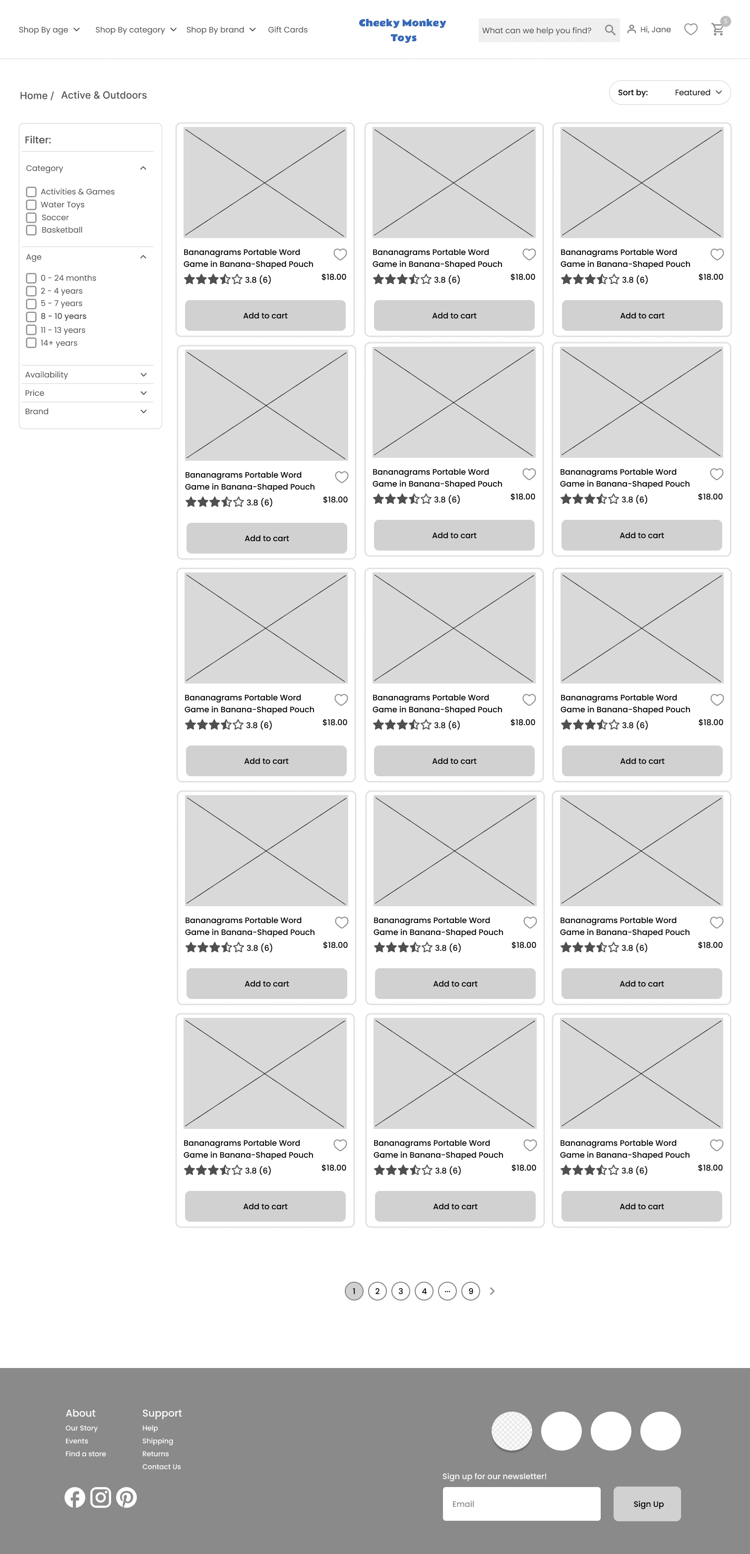
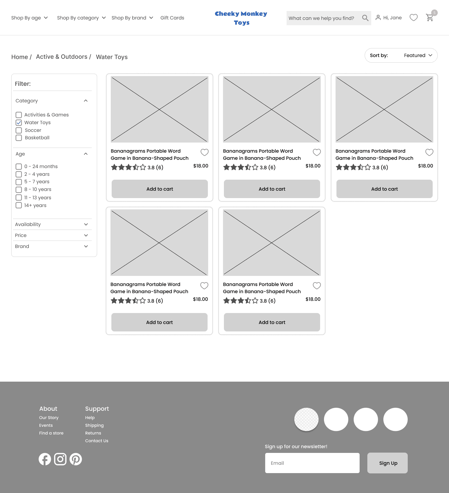
Additionally, I altered filters based on user feedback from interviews to help narrow down the search by age group, price, availability, and more. These filters only appear after clicking the options button, which isn't very intuitive for users. I moved them to the sidebar on all product landing pages for easier access.
Sitemap
With the navigation clarifiedI then built a sitemap that outlines the structure of the website, showing the relationships between pages, and mapped out user flows to illustrate the steps Jane takes to complete key site tasks to make a confident purchase. Creating an effective sitemap was a critical step in redesigning Cheeky Monkey toys website. The goal was to ensure a logical and intuitive structure that would improve navigation, streamline the user journey, and reduce friction in product discovery.
User Flow

Wireframes
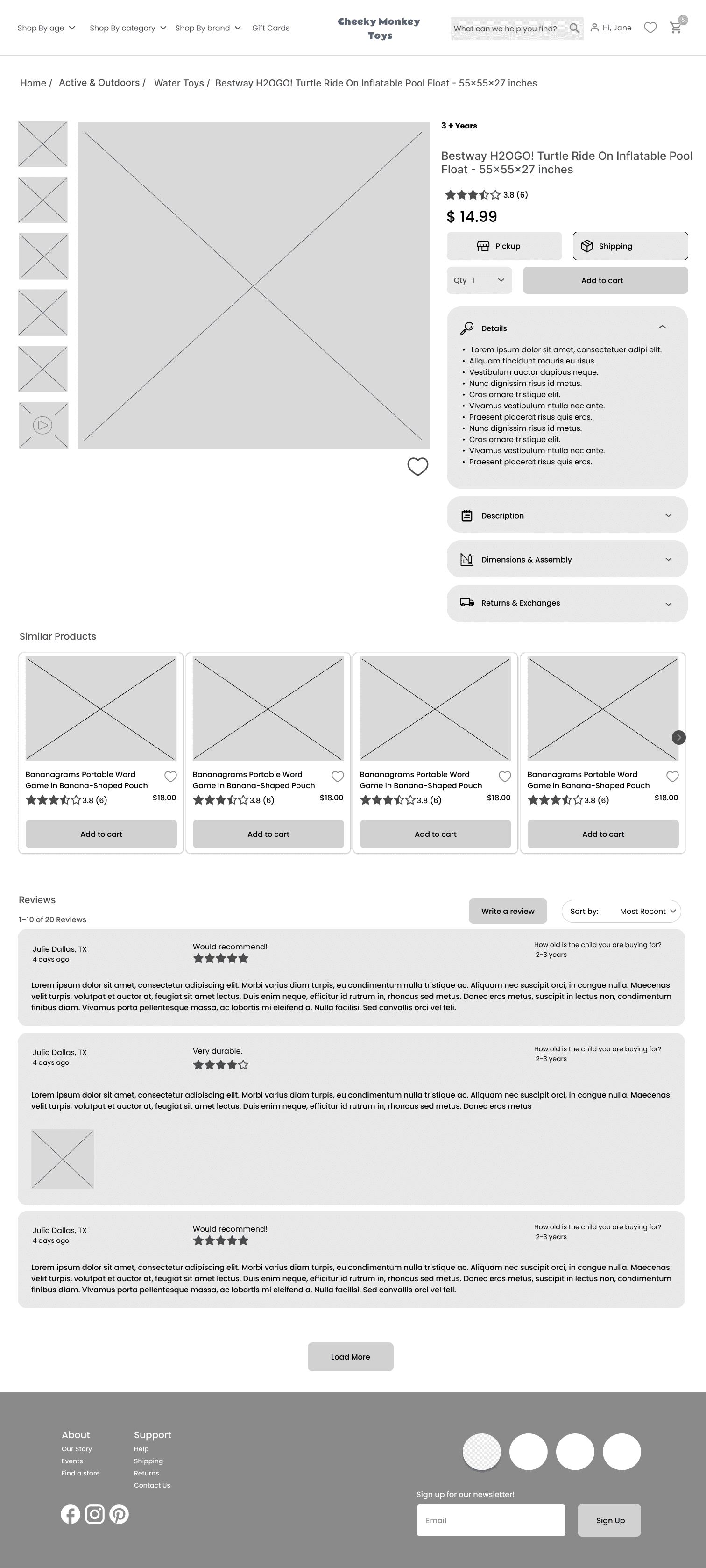
To create an intuitive user interface, I began by developing low-fidelity wireframes in Figma. The focus was on clear navigation, prominent product displays, and an accessible layout. The wireframes incorporated essential elements like a search bar, product categories, detailed description on PDPs, and user reviews to align with the needs for Jane.
Next Steps
Here are the findings from the usability test with 2 users and what I would do next on this project:
Make the category names on homepage images more prominent.
The gift card option may not be suitable for the top navigation.
Users want to see how the PDP (Product Detail Page) interacts when opening and closing each dropdown section.
Remove excessive white space on the PDP.
It's unclear what the heart icon in the navigation is for.


