A Tablet Educational APP
Empowering Children Through Personalized Stories
Role
UX Researcher UX Designer
Tool
Figma
Timeline
3 Weeks
About the Client
iPub Global Connection is a renowned publishing house with a diverse catalog that includes academic texts, children's literature, and more. With a strong commitment to inclusivity and education, the company aims to make literature accessible and engaging for all readers. Jennifer Wyman, a senior editor at iPub and the author of "SUPERabled," is a key figure in driving the company's initiatives, particularly in fostering inclusive reading experiences.
Project Overview
The project involved developing an innovative app designed to generate personalized stories for children using AI technology. The app's primary goal was to help students see themselves in literature, inspire a love for reading, and ensure that every child, regardless of their abilities, could engage with the content. Despite the ambitious and admirable vision, the project lacked a clear roadmap. My team and I, in collaboration with Jennifer Wyman and iPub's director, were tasked with transforming this vision into a tangible and functional reality.
The Big Questions
Before diving into design, we needed to tackle three critical questions:
AI Integration: How would the AI generate stories? What format would these stories take? Would there be images included?
Accessibility: How could we ensure that the app was accessible to children with mobility, visual, and speech impairments while maintaining a natural and engaging experience?
Student Interface: How could we design an onboarding process and interface that catered to a range of needs and abilities?
Discovery
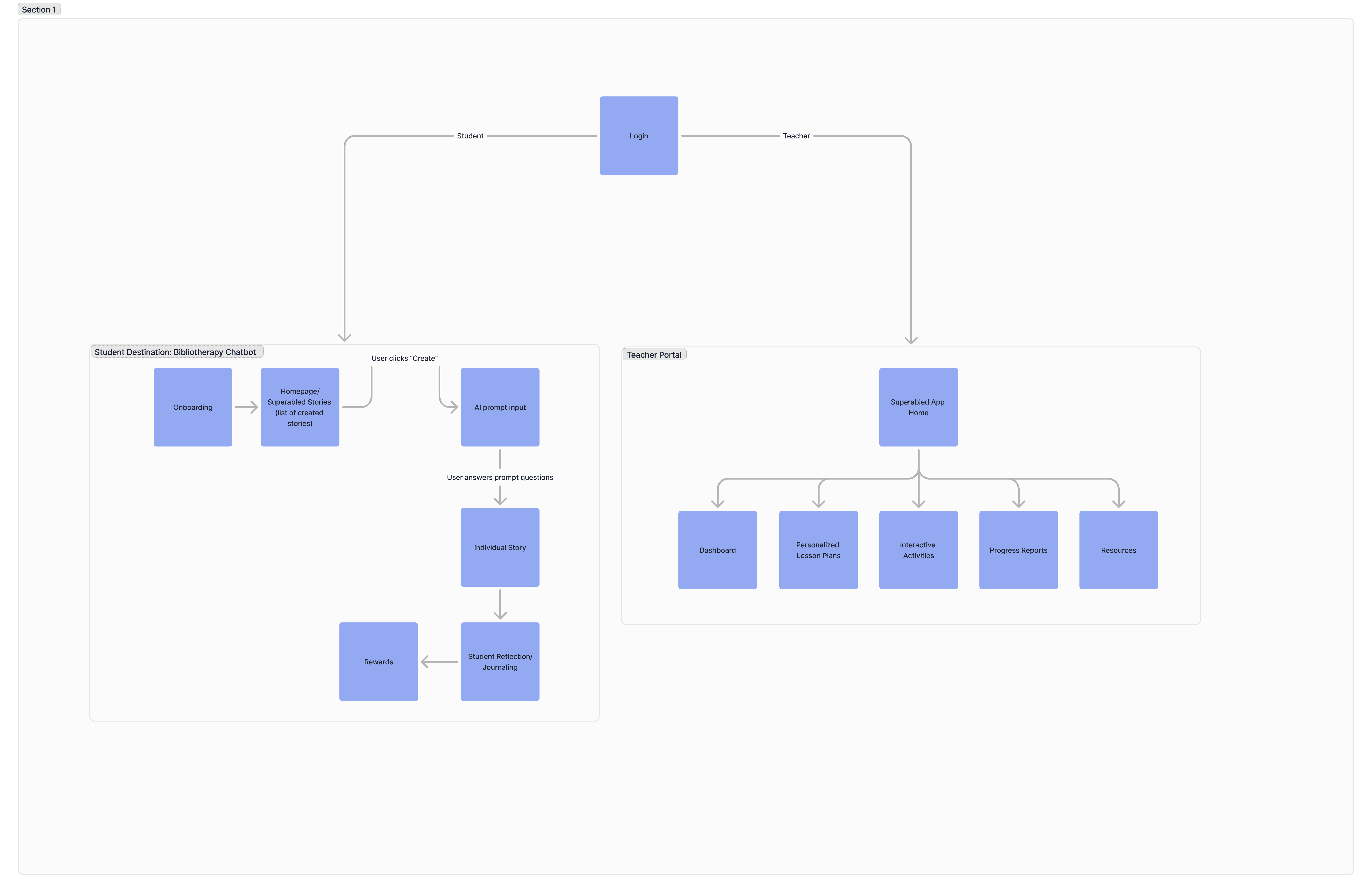
Initially, we found ourselves in a fog of uncertainty. The client’s brilliant vision needed a structured plan. We began by drafting a simple site map to outline the structure of the app, splitting it into the Student Portal and the Teacher Portal.
Competitive Analysis
As we waited for technical details from developers, we conducted a competitive analysis, studying educational apps like Epic and Reading Eggs, as well as accessibility-focused apps like Choiceworks and TD Snap. This helped us understand essential features and benchmarks.
Epic and Reading Eggs showcased various features in educational and reading apps, revealing different ways to engage users in learning.
Choiceworks and TD Snap emphasized essential aspects of accessibility and inclusivity, focusing on how to make apps usable for a wide range of needs.
By analyzing and integrating these diverse features, we aimed to blend the strengths of each approach.
Research Objectives
To gain insights, we interviewed a diverse group of experts:
5 Participants Total
1 Special Needs Aide
1 Board-Certified Behavioral Analyst and Clinical Director of Developmental Services for NE Florida
2 Parents of Children with Autism
1 Teacher for Neurodivergent Children
Research Objectives
Gather insights from experts, parents, and teachers on how to customize reading levels to meet the needs of each user.
Identify specific accessibility features required to accommodate users with mobility issues, visual impairments, and speech impediments in a reading app.
Understand effective teaching methods that enhance reading comprehension, build confidence, and maintain engagement.
Research Findings
Boosting Motivation: Short chapters help children feel accomplished and stay motivated to keep reading, with the reward being a sense of achievement.
Gamification Strategies: When the assignment feels like a game, my child remains engaged—especially if there are rewards.
Accessing Reading Levels And Cognitive Abilities: It's important to first assess the child's reading level and cognitive abilities, then tailor the reading materials and interface to meet their needs.
Student Confidence: Verbal praise is key to building confidence in their students
Persona
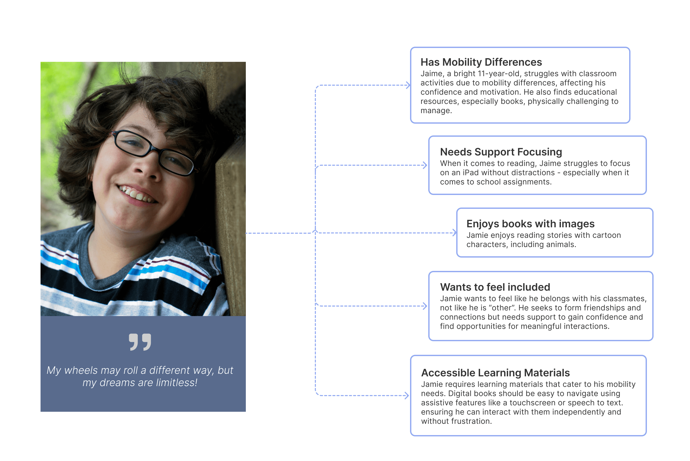
Creating a persona for this project was challenging due to the specific target user: a child with mobility issues. Our research data primarily focused on children with dyslexia, ADHD, visual impairments, and hearing impairments, and did not address the unique needs of children with mobility challenges. As a result, we had to develop a proto-persona to address this gap.
View Persona File
Wireframes
We weren't receiving much feedback from the client, and their vision for the app's design was unclear. We proceeded with the design phase based on insights from interviews, affinity mapping, and competitive analysis. We also consulted with the developers to ensure alignment.
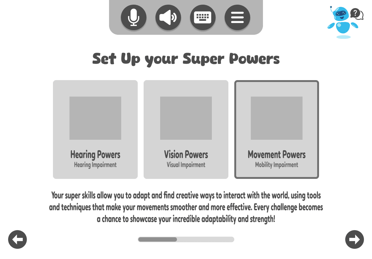
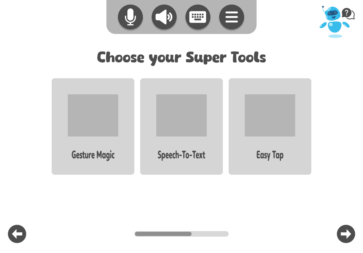
Since we didn't get much input from the client regarding accessibility for children with mobility issues, we took the initiative to research this ourselves. We decided the app should include an onboarding process to determine the tools each user needs based on their specific challenges. This information is crucial for creating a customizable interface.
Additionally, the client suggested integrating an AI bot for students to ask questions, so we incorporated this feature into the designs across the app's screens.
Another key aspect of the app was creating a portal for students and teachers.
We began with the student portal, as this was the client's top priority.
We designed an interface that allows students to create new stories, which will start the AI story generation user flow.
Students can also save their stories and return to them later.
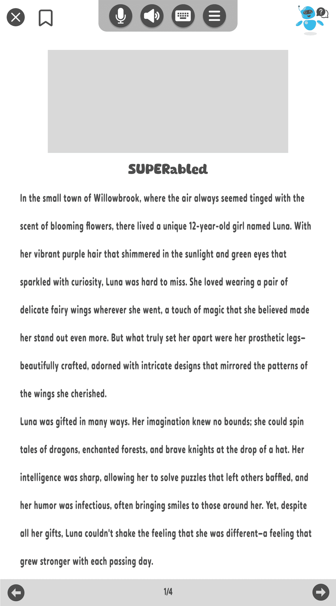
We incorporated Jennifer's SUPERabled book into the app to assess students' reading comprehension, aligning with the client's goal of encouraging reading and measuring comprehension.
After reviewing the wireframes with the client, they suggested adding a separate row for the author’s other books, anticipating a series release.
AI Story Generation
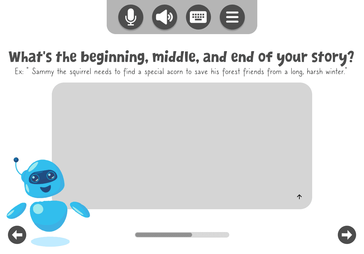
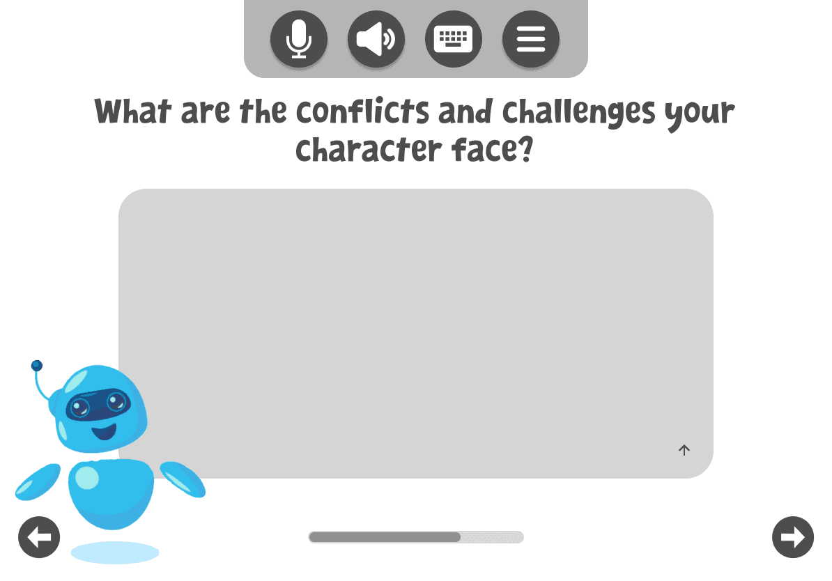
We then shifted our focus to designing the AI component, which was a bit challenging. The concept was that students would answer a series of questions, and this input would be fed into chatbot to generate a story about a character of their choice or themselves. Initially, the client provided us with prompt questions, and we had the answers as a textarea input.
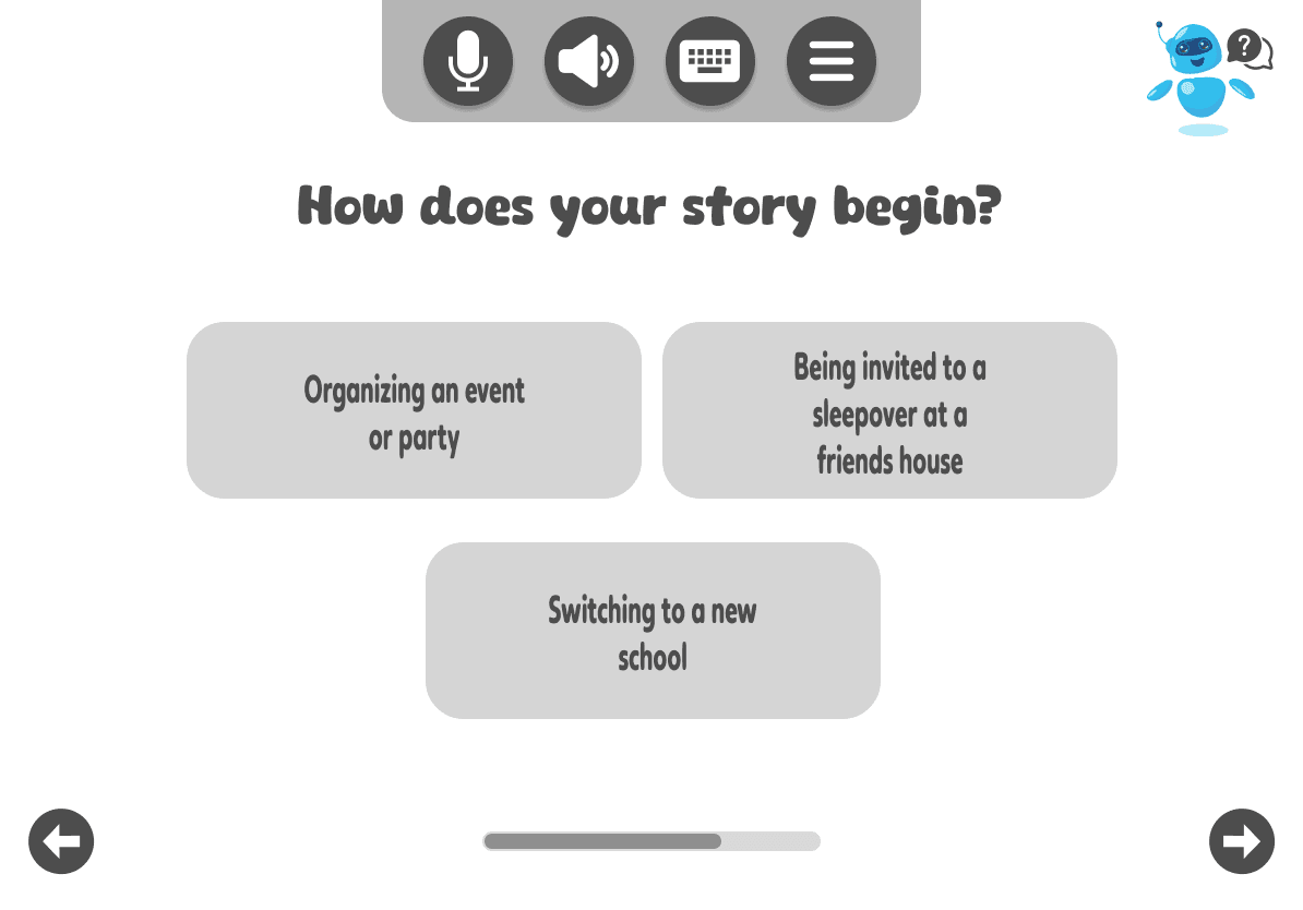
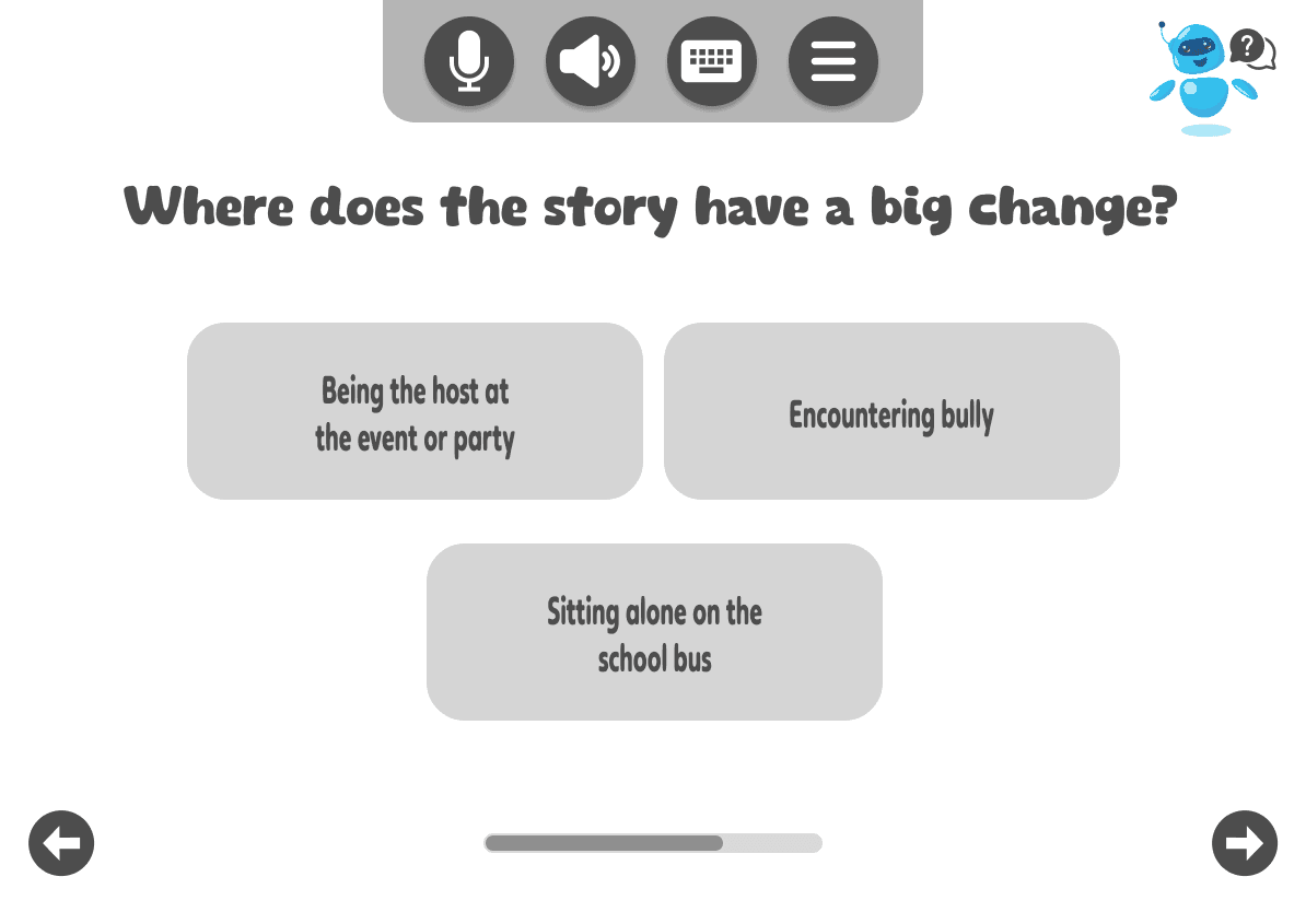
After running the designs by the client, Elyse, the graphic designer, assisted in defining constraints for the AI. To enable the AI to generate a coherent story, we needed to establish a story architecture and identify a set of key questions. We also then used multiple-choice answers to facilitate ease of use for students, particularly those with mobility challenges. This approach helps students select or speak their responses rather than typing in an open-ended textarea, which could be difficult for AI to interpret accurately.
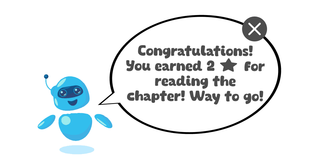
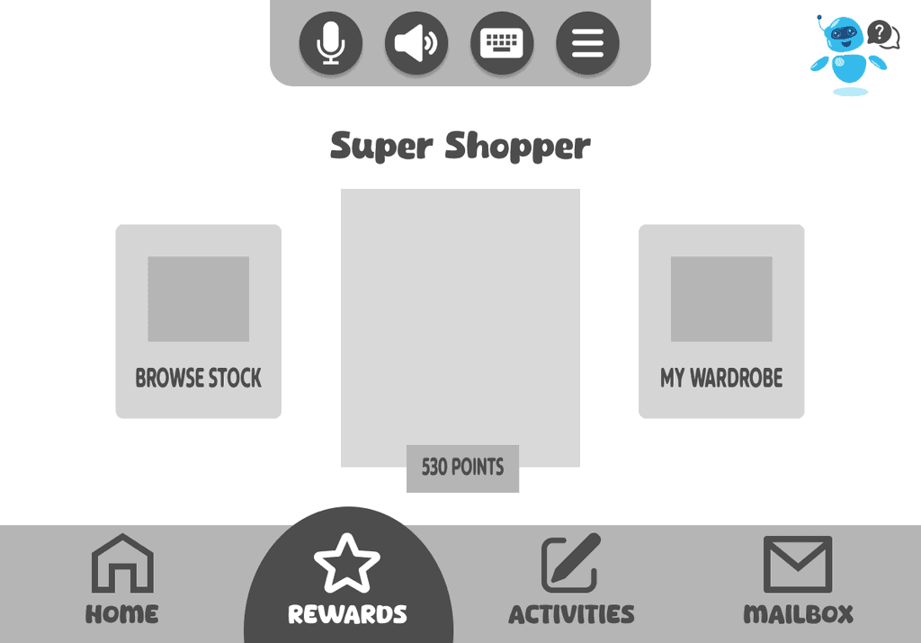
During the interviews with teachers, they frequently expressed a desire for rewards for students. To address this, we included a feature in our design that displays a popup to praise their achievements as they read. Students can accumulate these rewards and use them to customize their avatars with clothing and other items.
To keep students engaged, we ensured that the content on each page of the generated story was concise. In the high-fidelity design, we enhanced this by incorporating images and further shortening the text to create an experience similar to ones we saw in other children's books.
The accessibility aspect was crucial for the UI design of this app. It was essential that the design adheres to best practices in accessibility to ensure it’s usable for children with mobility issues.
Legible Fonts and Text: Used readable fonts with appropriate sizes and line spacing. Avoided overly decorative fonts and ensured that text remains legible in different sizes and styles. We initially had a different font in place, but after consulting with the client, we selected a new font. This choice avoids overly decorative styles while remaining playful and jovial, and it is easy to read for children, including those with dyslexia or visual impairments.
Inclusive Onboarding: We aimed to create an inclusive onboarding experience by integrating language that blends with the concept of "SUPERabled" book. We used terms like "super tools" and "super powers" in the onboarding to make the language more inclusive and empowering for all users.
Voice Commands: Integrated speech to text button where feasible, allowing users to navigate and interact with the app using spoken words or say the letter labeled with the answer.
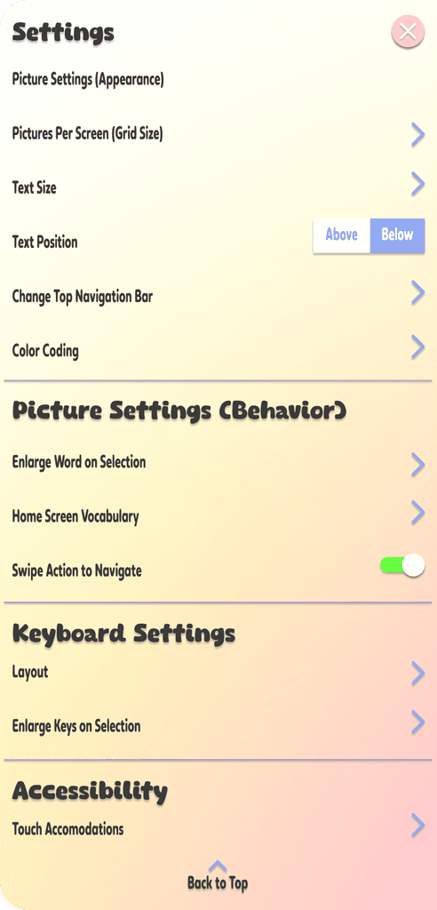
Customizable User Interface and Menus: Customized the interface, such as changing text size, color schemes, or layout preferences. The top navigation bar allows users to adjust settings to suit their individual needs at any time.
Pre-Labeled Choices for AI Story Prompts: This feature was added after discussing the mockups with the client, based on their feedback, we added labels to each answer in AI prompts. Students using speech to text technology can just say B and it would choose the option instead of them having to speak through the whole answer.
We used colors from the client's existing logo but adjusted them to be softer and more pastel. Our goal was to evoke a sense of joy and focus. Yellow was chosen for its focusing effect, while orange and pink provided grounding, and blues and purples offered a soothing quality. We aimed to ensure that the app delivered a seamless experience of ease, encouraging students to engage with a sense of playfulness and gamification, reflected in both the colors and typography.
For the typography, we selected The Fruit Star for its cheerful and playful appearance, which perfectly matches the app's fun and engaging vibe. To complement it, we paired it with Pemanka, a font recognized for its excellent readability, ensuring that all users can comfortably access and read the content. This combination strikes a balance between visual appeal and practicality, enhancing the app's design while reinforcing its commitment to inclusivity.
Navigation & Information Architecture
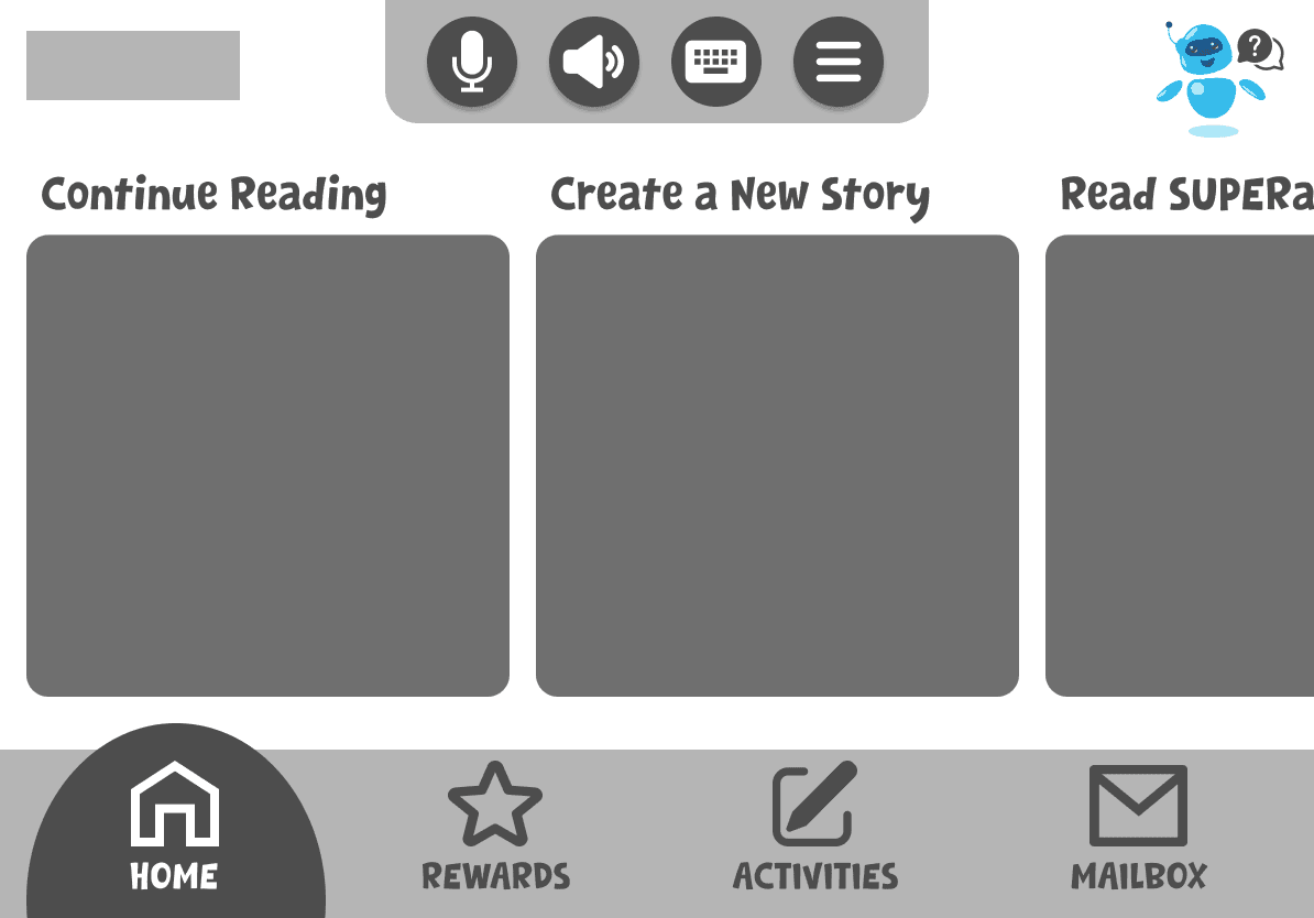
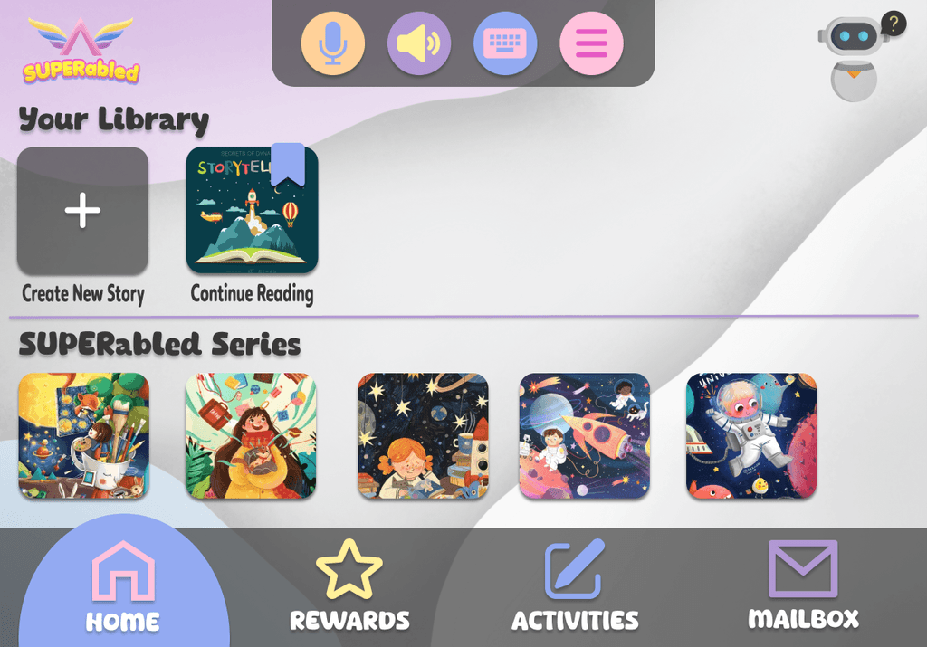
We began by designing the app’s navigation and information structure. Based on research and interviews, we decided on a simple bottom navigation bar with four main sections: Home, Rewards, Activities, and Mailbox.
On the Home page, we created two distinct rows: one for user-generated stories and another for Super Abled stories. This setup allowed us to assess reading comprehension more effectively, addressing a gap that user-generated stories alone couldn’t fill. Simply writing a story doesn’t guarantee that the student has read it, so incorporating the Super Abled series helped us measure comprehension while still offering AI-generated stories to ensure diverse representation.
To enhance engagement, we integrated rewards based on gamification research. Users earn reward money by completing tasks and chapters, which they can use to customize their avatars, adding a fun and interactive element motivated by rewards.
The Activities page serves as a testing ground for reading comprehension. For Super Abled series books, we use multiple-choice questions to assess understanding. For AI-generated stories, we include meditation journals to encourage reflection, self-empowerment, and confidence.
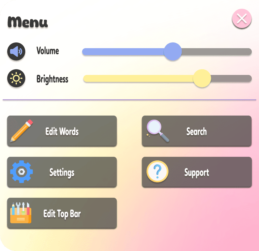
We also added a student mailbox to facilitate communication between students and teachers. The app’s menu is highly customizable, allowing users to adjust volume, brightness, text size, text position, and navigation options to suit their preferences. We based these features on the most common elements found in our competitive analysis.
Below is the student homepage which shows these tabs and the top navigation bar.
We designed a customizable nav bar, allowing users to include the accessibility features they rely on most. For Jamie, our persona, this included speech-to-text, an adaptive keyboard, and voice commands.
For accessibility, we designed a customizable menu where users can adjust volume, brightness, text size, text position, and navigation preferences. We chose legible, large fonts that are easy to read, avoiding overly decorative styles to accommodate children with dyslexia or visual impairments.
Next Steps
Usability testing: We will do usability testing with children with mobility issues to see if the app is suitable for them.
Consolidate AI Prompts: We'd shorten the AI prompts from 16 pages to maintain user interest and focus, consolidating the content to make it more engaging.
Word highlighting: Enable word highlighting while reading stories, similar to the Kindle experience.
Adjustable Font Size and Style: Allows users to change the font size and style to suit their reading preferences and needs.Accessibility: Consult with experts in accessibility to gain insights on how to enhance our design with accessibility considerations for all interfaces.
Teacher portal: We'd design the teacher portal more extensively and build in the features teachers' most requested, in order to highlight the educational needs of the app
Content: We'd work with a UX content team to work on the right verbiage for the app, make sure it is appropriate for each child's needs. And also work with a team to source or create illustrations/images for the app.
Image Sourcing: We plan to hire illustrators to create cohesive images for the app, ensuring a unified visual experience. Currently, we're using images from free resources that don’t fully match the overall design aesthetic.

